Company showcaseBranding
Sweets’nd Bakes
The available brand application shows Sweets’nd Bakes on a carrier bag. A hand-drawn wordmark, cupcake icon, soft pink field and repeating illustration pattern combine into a light, playful expression.
Explore the showcase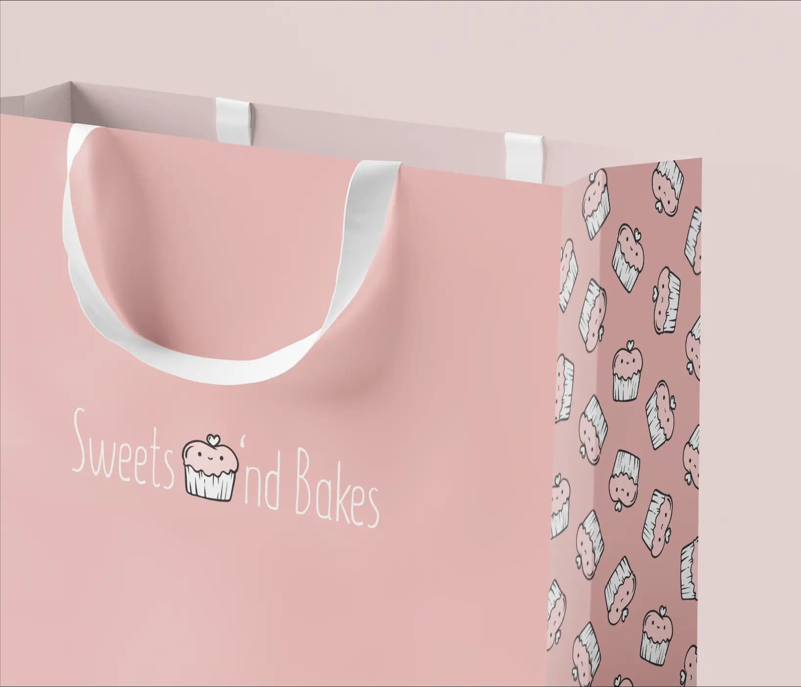
- Client
- Sweets’nd Bakes
- Expertise
- Branding
- Scope
- Branding
01 — Company showcase
A friendly bakery identity that also works as a pattern
The front gives the name generous space, with the cupcake icon incorporated into the wordmark. Thin hand-drawn letters and white print contrast quietly with the powder-pink bag.
The side repeats the same icon as a pattern. This allows the symbol to work both as a small recognition point and as a decorative system across a larger surface without introducing additional elements.
The challenge
The visible design challenge is to make a simple brand set sufficiently recognisable on both a large front and a narrow side. The name and illustration need to work separately while still clearly belonging together.
Our approach
The visible approach makes one cupcake illustration the central building block. On the front it supports the brand name; on the side it repeats in different positions as a pattern. The limited pink-and-white palette and white handles keep the application quiet and consistent.
04 — Our approach
Design decisions
Icon and name become one
The cupcake is incorporated directly into the wordmark and makes the product world visible.
One illustration becomes a pattern
The side repeats the symbol to create a recognisable decorative structure.
A limited colour palette
Powder pink, white and black illustration lines keep the bag light and coherent.
05 — Scope
What we delivered
- 01Branding
06 — The outcome
The outcome
The displayed final work is a carrier bag on which wordmark, icon and pattern operate as one flexible brand system. The identity remains recognisable across both the broad and narrow surfaces.