Company showcaseBranding · Website design
UCS
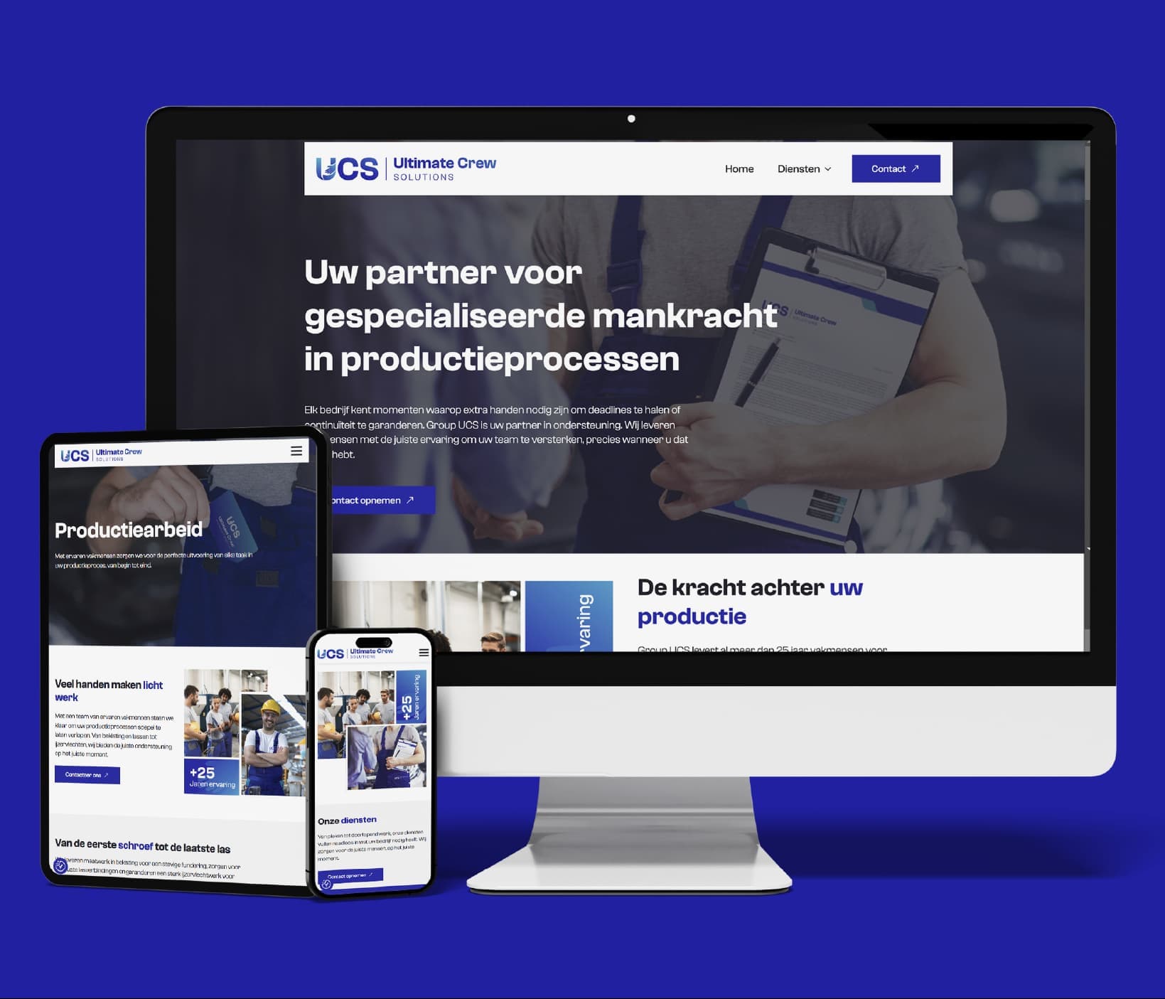
The UCS showcase combines branding and web design. Its blue-and-turquoise palette, compact symbol and typographic style recur across letterheads, envelopes, business cards and the website on several screen sizes.
Explore the showcase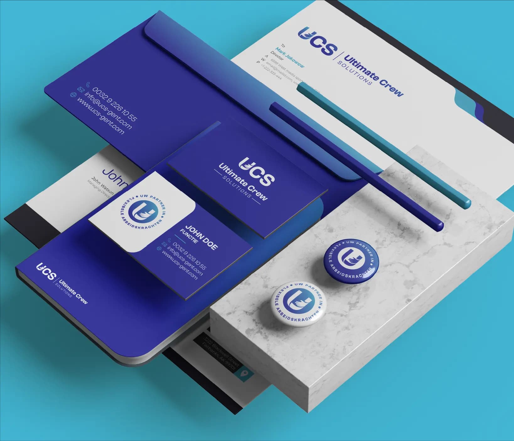
- Client
- UCS
- Expertise
- Branding · Website design
- Scope
- Branding · Website design
01 — Company showcase
One visual line for brand, services and contact
The brand applications show how the UCS logo and gradients work on both small contact items and larger stationery. Contact details, icons and the symbol have fixed positions within a clear white-and-blue system.
The website uses the same building blocks for a service-led structure. A clear lead message, recognisable production-work and service sections, workforce imagery and visible contact actions remain legible in tablet and mobile compositions.
The challenge
The visible work needs to bring a broad service presentation and several contact formats under one brand expression. The system must remain recognisable from a business card or envelope to a full website on desktop and mobile.
Our approach
The visible approach starts with a fixed logo, deep blues and turquoise accents. In print, those elements order sender details, contact information and the brand message; on the website, they guide navigation, headings, information sections and contact actions. The device mock-ups show the hierarchy rearranged for each screen size without changing the visual line.
04 — Our approach
Design decisions
A consistent brand anchor
Logo, symbol and blue-to-turquoise gradient recur consistently across every visible touchpoint.
Services arranged in clear layers
Lead message, services, supporting imagery and contact actions each receive a distinct place on the website.
Designed across formats
Stationery and desktop, tablet and mobile screens maintain the same recognisable hierarchy.
05 — Scope
What we delivered
- 01Branding
- 02Website design
06 — The work in pictures
The work in pictures
07 — The outcome
The outcome
The displayed final work forms a coherent brand family spanning stationery and a responsive website. Shared colours, shapes and typographic accents make UCS recognisable across physical and digital applications.