Company showcaseBranding
Lahlali & Partners
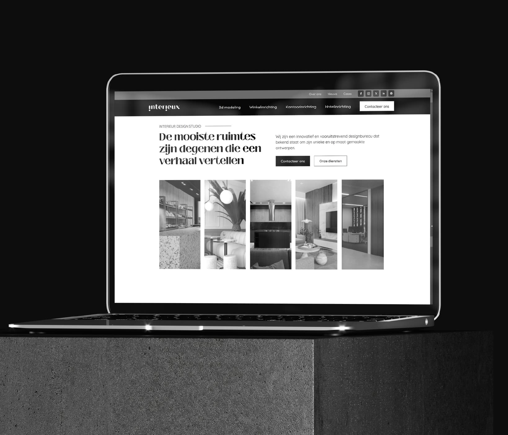
The available brand work presents Lahlali & Partners in a dark-blue and gold system. An LP monogram, precise typography, heavy paper, envelopes, business cards, a seal and a digital page form a layered but recognisable presentation.
Explore the showcase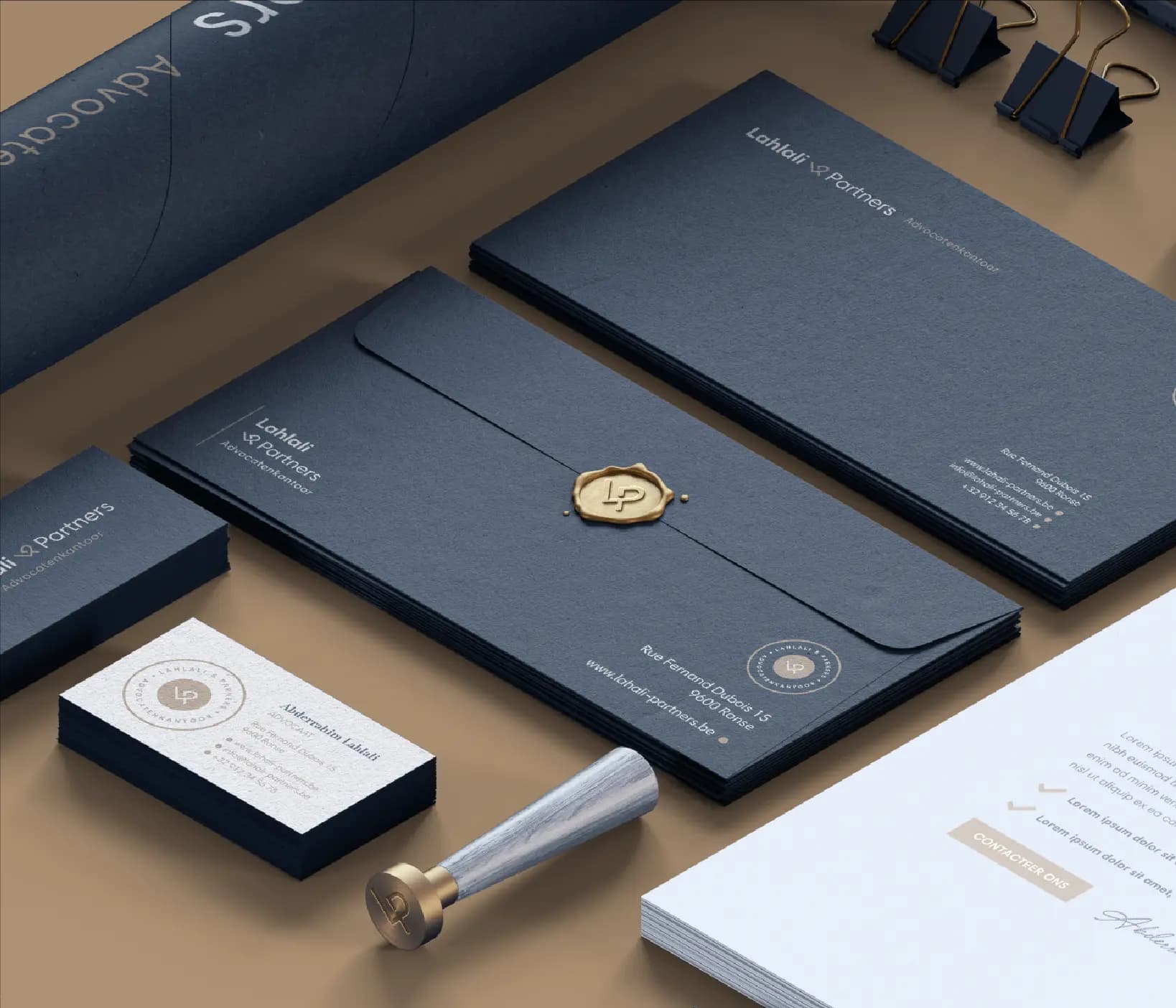
- Client
- Lahlali & Partners
- Expertise
- Branding
- Scope
- Branding
01 — Company showcase
A professional identity carried by monogram and material
The LP monogram works as a compact recognition mark on cards, envelopes and the physical seal. The full name and supporting information use fine typography, generous margins and fixed alignment across the different stationery formats.
Dark-blue paper, light print and gold-coloured details create a consistent material contrast. The visible digital application carries the soft beige and dark-blue tones, typographic calm and rounded interaction elements onto the screen.
The challenge
The visible design challenge is to make a long name and several information levels work across small cards, larger documents and a digital screen. The system needs to remain refined without making legibility dependent on decoration.
Our approach
The visible approach makes the LP monogram the compact anchor and uses the full name when more space is available. Generous whitespace, fine lines and a dark-blue and gold material palette organise the printed items; the digital application translates the same calm into typography and buttons. The seal adds a tactile version of the monogram without introducing a new symbol.
04 — Our approach
Design decisions
Monogram as compact anchor
The LP mark recurs on cards, envelopes and the seal where the full name has less room.
Material and colour in balance
Dark-blue paper, light typography and gold-coloured details connect the printed family.
The same calm on screen
The digital application visibly carries over the typographic hierarchy and restrained contrast.
05 — Scope
What we delivered
- 01Branding
06 — The outcome
The outcome
The displayed final work forms a coherent identity across stationery, physical finish and digital design. Monogram, name, colour and typography remain recognisable as format and material change.