Company showcaseTrade stand visuals · Advertorial design
Gondella
The Gondella showcase brings trade-stand visuals and an advertorial together. Its characteristic red, white wordmark, retail imagery and clear information hierarchy connect a spatial presentation with a printed editorial application.
Explore the showcase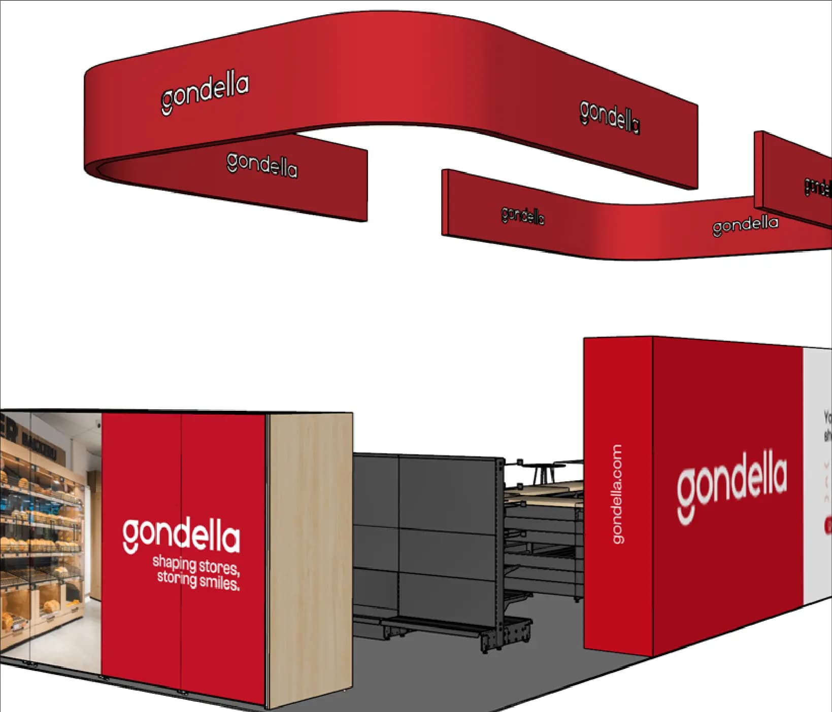
- Client
- Gondella
- Expertise
- Trade stand visuals · Advertorial design
- Scope
- Trade stand visuals · Advertorial design
01 — Company showcase
A recognisable brand language from exhibition floor to publication
The stand visuals use large red surfaces, curved overhead structures and repeated logos to make the brand recognisable from several viewing directions. Wood tones and dark shelving structures place the presentation visibly in a retail-interior context.
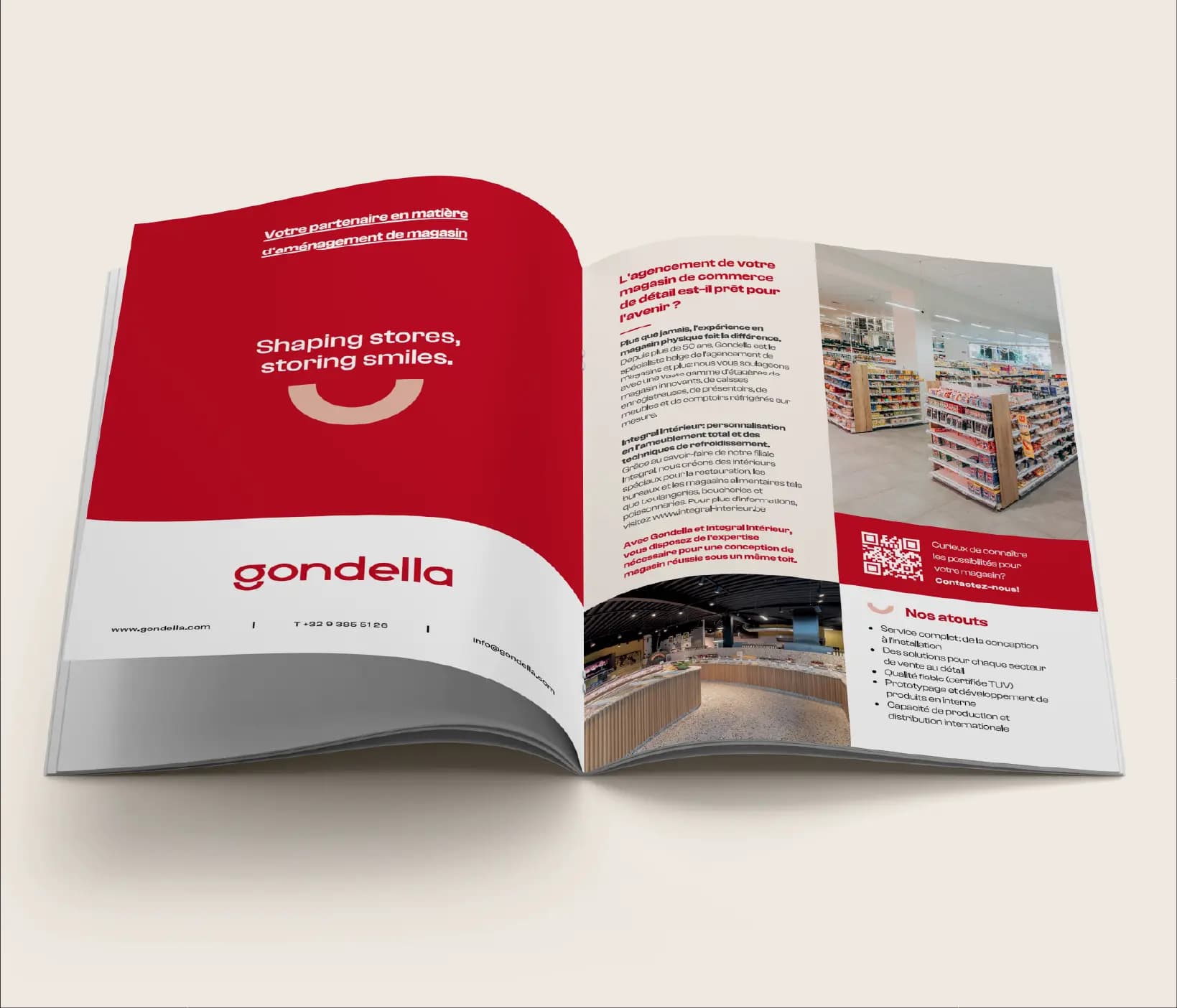
The advertorial translates that recognition into a spread with large red fields, project photography, text columns and a QR code. Headings, benefits and contact details occupy separate zones so image and information can work alongside one another.
The challenge
The visible design challenge is to keep one brand recognisable in both a large spatial application and a compact, information-rich publication. Each format requires a different reading distance and a different balance between logo, imagery and explanation.
Our approach
The visible approach uses Gondella red and the wordmark as fixed recognition points. In the stand visuals they are enlarged and repeated for visibility around the space; in the advertorial they form the basis for headings, content panels and the closing contact area. Retail imagery gives both applications the same content context.
04 — Our approach
Design decisions
Recognition at a distance
Large red structures and repeated logos make the brand visible from different sides of the stand.
Editorial information organised
Headings, photography, columns, benefits and QR code each receive a clear zone in the advertorial.
The same context at two scales
Retail imagery, wood tones and brand red connect the spatial and printed applications.
05 — Scope
What we delivered
- 01Trade stand visuals
- 02Advertorial design
06 — The work in pictures
The work in pictures
07 — The outcome
The outcome
The displayed final work consists of spatial stand concepts and a developed advertorial spread. Despite their different scale, they share the same colour, brand accents and retail context.