Company showcaseGraphic design
BS Bouw
The available work shows the BS Bouw identity on the front and back of a dark work jacket. A large back logo, compact chest mark and bright-blue accents are positioned around the existing reflective bands.
Explore the showcase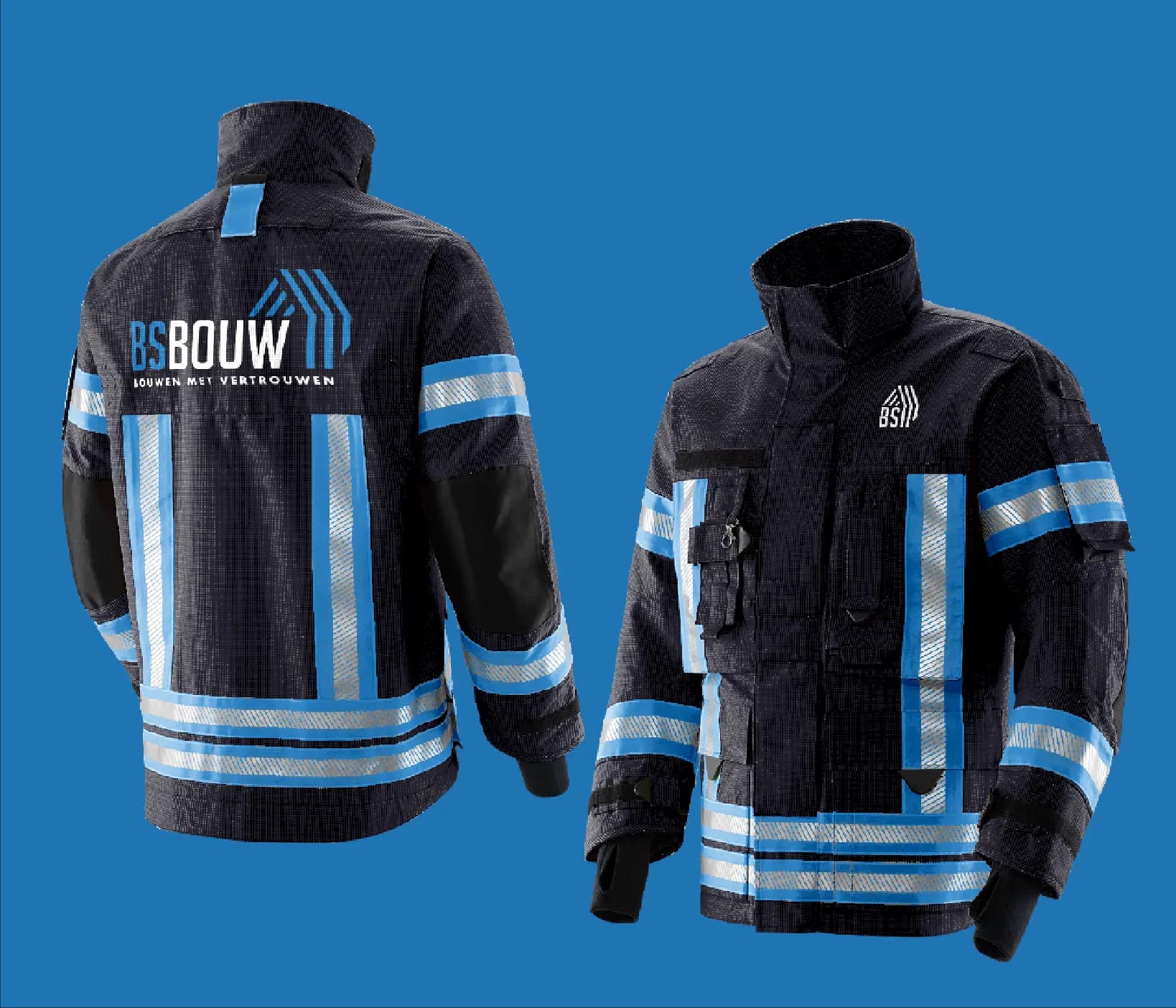
- Client
- BS Bouw
- Expertise
- Graphic design
- Scope
- Graphic design
01 — Company showcase
A brand application designed around visible workwear use
The back gives the full wordmark, symbol and tagline the largest area. Light lettering and blue lines contrast with the dark fabric and remain visually separate from the horizontal reflective band.
On the front, the same system is reduced to a smaller chest mark. Blue vertical panels and reflective bands carry the brand colour across the jacket without hiding its functional clothing details.
The challenge
The visible design challenge is to apply the identity to a jacket that already contains strong seams, pockets, colour panels and reflective bands. Front and back also require different scales of the same brand.
Our approach
The visible approach uses the back as the main surface for the complete logo and reserves the chest for a compact symbol. Blue brand lines align with the jacket’s vertical panels while the white and reflective zones remain clearly readable. The graphic application therefore follows the construction of the garment.
04 — Our approach
Design decisions
Two levels of recognition
A large back logo and compact chest mark use the same symbol at an adjusted scale.
Graphics follow the jacket
Blue lines align with vertical panels, seams and the garment’s existing colour distribution.
Reflective zones remain clear
The brand application is built around the visible reflective bands.
05 — Scope
What we delivered
- 01Graphic design
06 — The outcome
The outcome
The displayed final work is a coordinated front-and-back workwear application for BS Bouw. The logo remains recognisable at two sizes and the brand accents visibly connect with the functional structure of the jacket.